

'F.I.S.H.' gotta fly: The river under the I-35 bridge, once a wasteland, is now a civic treasure. San Antonio Museum of Art terminates the view.
Placemaking at its best
In Urban Segment of Museum Reach, designers, artists,
craftsmen extend Hugman's vision for River Walk


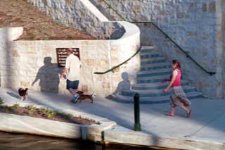
Dogs high-bred and low, on leashes. And babies in strollers. One young couple juggled both species: He led twin boxer puppies; she pushed twin human puppies in a tandem pram. Bicyclists, too, plied the walkways, and quite a number of runners. San Antonio
 Symphony principal bassist
Steve Zeserman jogged to and fro, dreaming of Bottesini (Gio.).
 At sunset, a few dozen sat on retaining walls and waited -- some for the nightly illumination of Donald Lipski’s “F.I.S.H.,” frozen en route to Austin under the I-35 bridge; others to observe an older nightly ritual, the dinnertime emergence of Mexican free-tailed bats from their steel caves under the freeway bridge.
The San Antonio River Improvements, the San Antonio River Authority’s ambitious program to extend the historic River Walk’s park-like pedestrian environment north to Hildebrand Avenue and south to Mission Espada, have drawn doubters and naysayers. Just another boondoggle for politically connected property owners, said some. Just another playground for tourists, said others. It wouldn’t do a thing for the locals.
But the phase that opened at the end of May, formally the Urban Segment of the Museum Reach, settled immediately into the life of the city and its people. Locals didn’t come just to look and satisfy their curiosity, but to use and enjoy. Irby Hightower, a partner in Alamo Architects -- a firm that wasn’t involved in the project -- put it well: The community’s embrace of the Urban Segment, he said, showed “how hungry people are for a quality urban environment.”
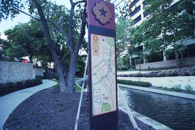
Left: The Urban Segment has become a popular pooch promenade. Note metal directional sign on handsome limestone walls, bue tile risers on stairway.
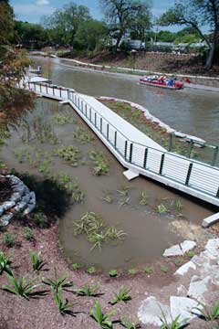
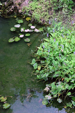
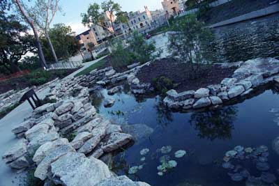
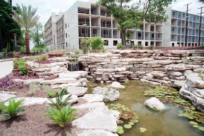
Top: Before construction on the Urban Segment began, water lilies and rushes sprouted in shallow areas of the stream. The designers evoke a memory of the natural river in an artificial marshland (above) behind Pearl and a demonstration of "riparian ecology" (right) near I-35 bridge.
Just upstream of Lexington, past the end of the walkways, Hugman terminated the project with a picturesque low dam of dressed with stone spillways and artfully placed boulders. Between the dam and the vicinity of the San Antonio Zoo in Brackenridge Park, most of the river remained more or less natural, a narrow channel between steep banks covered with dense vegetation, visited by graceful egrets and night herons. The view from bridges was alluring, if one overlooked the dumped and flood-borne detritus -- and the homeless people clambering to and from their shelters under the bridges.
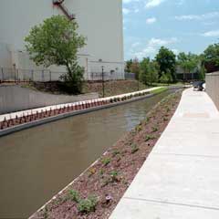
The Urban Segment of the Museum Reach extends the River Walk concept 1.33 miles from Lexington Avenue to Josephine Street. The channel has been widened, deepened, lined with concrete and, with the insertion of a pair of locks and a dam upstream of
 Brooklyn Avenue, made navigable
by sightseeing barge as far as a turning basin at Grayson Street, next
to the Pearl Brewery redevelopment. Most of the natural vegetation was
cleared and replaced with a carefully planned native landscape,
walkways, benches, sheltered overlooks, stairway and ramp entries from
most streets, and extensive public art. (Still being designed is the
future Park Segment of the
Museum Reach, which will extend upstream from Josephine Street to
Hildebrand Avenue.)
Brooklyn Avenue, made navigable
by sightseeing barge as far as a turning basin at Grayson Street, next
to the Pearl Brewery redevelopment. Most of the natural vegetation was
cleared and replaced with a carefully planned native landscape,
walkways, benches, sheltered overlooks, stairway and ramp entries from
most streets, and extensive public art. (Still being designed is the
future Park Segment of the
Museum Reach, which will extend upstream from Josephine Street to
Hildebrand Avenue.)Ford, Powell & Carson Inc., the venerable San Antonio architecture firm, headed the design team; Boone Powell was the principal in charge and lead designer. The landscape architect was Cullen Coltrane of CFZ Group, also of San Antonio. Also a crucial contributor to the design team was the San Antonio River Foundation's art and architecture project manager, Mike Addkison. The foundation commissioned most of the project's art works -- probably the most extensive and ambitious program of public art San Antonio has seen since HemisFair '68.
Local knowledge was key to the design team’s success in adapting Hugman’s picturesque, Mediterranean sensibility to a very different urban context, contemporary aesthetics and environmental interests, and new requirements, including accessibility to wheelchairs.
In some ways, the context gave the design team advantages that were not available to Hugman. Streets dead-end at the river at five locations along the Urban Segment. Those dead ends provided opportunities for generously scaled and landscaped pedestrian entries, with room for wheelchair ramps, and smoother transitions from street to river than were possible in most of the downtown core.
Eschewing homogeneity and generic picturesqueness, the designers found a surprising variety of responses to these opportunities -- at Myrtle Street, a line of crape myrtles and
 a
semiformal array of fountain
grasses; at Quincy and Schiller streets, a carved-limestone children’s
seating group by Dallas-area sculptor Sandi Stein; at 12th Street and
Avenue A, a waterfall and lily pond set into a naturalistic ledge of
stacked limestone. Too, the river right-of-way in the Urban Segment has
greater variation in width than in the densely developed downtown core,
allowing a rhythm of wide and narrow spaces.
a
semiformal array of fountain
grasses; at Quincy and Schiller streets, a carved-limestone children’s
seating group by Dallas-area sculptor Sandi Stein; at 12th Street and
Avenue A, a waterfall and lily pond set into a naturalistic ledge of
stacked limestone. Too, the river right-of-way in the Urban Segment has
greater variation in width than in the densely developed downtown core,
allowing a rhythm of wide and narrow spaces.Some of those narrow spaces were too narrow to allow much landscaping beyond the bare essentials, and some short segments feel hemmed in by adjacent private development. The retaining wall behind the San Antonio Museum of Art and the high blank wall of one old Pearl Brewery building impose a canyon effect, although ongoing redevelopment at Pearl is likely to improve the latter prospect markedly.
The preponderance of unattractive industrial property, parking lots and vacant tracts abutting the Urban Segment is a problem for the present, but an opportunity for the long term. The River North Master Plan, its form-based code and the streetscape enhancements it calls for hold a strong promise that the opportunity will be seized.
Redevelopment of one large industrial tract is well under way, and superbly executed, at the former brewery. Within view of the turning basin, Lake-Flato Architects designed the metamorphosis of the former Full Goods Warehouse into a contemporary
 industrial-aesthetic mixed-use
building. A few blocks downstream, the lily pond at 12th Street has for
a backdrop the unfinished skeleton of a long-dormant mixed-use project
that covers two full blocks between Avenue A and Broadway. Ed Cross,
the pinch-hit developer, has obtained financing to complete the
project, now given the overreachingly hipoid name “12WELVE 2WENTY1,”
for its address on Broadway. An extensive redesign, also by Lake-Flato,
takes advantage of the new river entry by putting the residential
component’s leasing office and an entry immediately across the street,
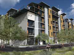
in bays that had been designated for garages.